Connect with us

Strategies

Consumers say compact logos signal product safety

The findings reveal that typography — specifically tracking, or the spacing between letters in a word — can influence consumers’ interpretations of brand logos.

Published

on

Photo by @slidebean from Unsplash.com

Compact logos can encourage favorable brand evaluations by signaling product safety, according to a new study by researchers at Boston College’s Carroll School of Management and Indian Institute of Management Udaipur, who reviewed the opinions of 17,000 consumers and conducted additional experiments with a variety of logos.

The findings reveal that typography — specifically tracking, or the spacing between letters in a word — can influence consumers’ interpretations of brand logos. Further, the interpretation is influenced by cultural factors, the researchers reported in a recent edition of the Journal of Consumer Research.

In addition to the survey data, the results were confirmed in experiments, even during the Covid-19 pandemic, when public health guidance on social or physical distancing put a new emphasis on space, Hagtvedt said.

“We found fairly consistent patterns in these responses, even during the pandemic, when some brands were experimenting with placing the letters of logos farther apart to emulate a social distancing signal,” said Boston College Associate Professor of Marketing Henrik Hagtvedt, who co-authored the paper with IIM’s Tanvi Gupta.

The researchers analyzed data from 17,000 consumers rating 629 brands. Hagtvedt and Gupta found compact logos, where tight tracking leaves less space, encouraged favorable brand attitudes when compared to loose logos, where loose tracking creates a more spacious appearance. According to consumers, compact logos signaled that the brand was reliable, secure, and trustworthy.

Logos are central to the ways brands communicate with consumers. Logos that appear physically robust imply a brand’s products are safe to use, Hagtvedt said. Compact logos were shown to send a message to consumers implying their products were sturdy and secure. This is particularly the case with textual logos, where consumers show sensitivity to the spacing between letters. Tight lettering equates to sturdiness in the minds of most consumers, whereas too much space may imply vulnerability, Hagtvedt said.

Cultural influences are also at play, according to the new report, titled “Safe Together, Vulnerable Apart: How Interstitial Space in Text Logos Impacts Brand Attitudes in Tight versus Loose Cultures.” Drawing on the work of anthropologists, the researchers focused on two groups of consumers: those considered culturally “tight” or “loose.” Tight cultures are a function of adapting to threats, such as violence or natural disasters. Individuals from this group are likely to favor the appearance of tight structure.

In the US, studies have shown southern states tend to display cultural tightness, while states in the west and northeast reveal looser structure. Factors such as religion, organization, or industry, can influence cultural tightness.

Gupta and Hagtvedt report that consumers tended to favor compact logos over spacious ones, regardless of cultural tightness, under ordinary circumstances. However, when the experiments involved contexts with potential safety concerns (such as products related to pharmaceuticals or mobile financial services), only culturally tight consumers responded more favorably to the compact logos.

The researchers suspect that the latter findings stem from culturally loose individuals associating space with freedom or autonomy, and being especially sensitive to that signal when safety is threatened. Among these individuals, the restrictive associations of compact logos can balance out the positive security signal.

The findings add to the understanding of how people draw meaning from visual communications, a key insight for brand managers and businesses of all sizes, said Hagtvedt. At the same time, they provide practical tips to organizations and individuals seeking to signal safety, depending on the context as well as the relevant culture.

Developing better quantitative standards can help organizations better assess how their designs may be perceived, rather than going on “gut” intuition about what makes a successful logo.

“It is important to know what kind of signal a logo sends,” said Hagtvedt. “Businesses spend millions on not just designing their logos, but on using their logos in brand communications. It is arguably the most prominent representation of a brand, wherever that brand operates. It has an enormous influence on consumers. To design and deploy a logo haphazardly is a questionable practice.”

BizNews

Tip for resto owners and managers: Plating matters, and how sauce placement can make a dish appear healthier

The way food is presented can shape diners’ expectations before they even taste it.
Published

on

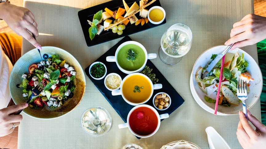
Our experience of eating is shaped by the combined influence of vision, smell, touch, and taste. The way food is presented can shape diners’ expectations before they even taste it. Visual features, such as arrangement and esthetic design, can influence perceptions of taste, quality, healthiness, and overall appeal.

Although previous studies have examined factors such as plate size, arrangement, and neatness, relatively little attention has been given to sauce presentation. Sauces can serve as both flavor additions and visual elements, and their placement may shape how diners perceive and interact with a dish.

To investigate these effects, researchers led by Dr. Kosuke Motoki of the Faculty of Business and Commerce, Keio University, Japan, examined how chef-designed sauce presentations influence consumers’ evaluations of a dish. The research was conducted in collaboration with Dr. Kohei Yamaguchi and Dr. Haruka Tohara of the Department of Dysphagia Rehabilitation, Institute of Science Tokyo, Japan, and Dr. Shin-ichi Ishikawa of the Department of Food Science and Business, Miyagi University, Japan, along with Chef Tatsuya Noda of the PLUM KNOT Co., Ltd., Japan. Their findings were published in Volume 15, Issue 17 of the journal Foods.

The idea for the study grew from discussions among Dr. Motoki, Dr. Yamaguchi, Dr. Ishikawa, and Chef Noda about food artistry and plating at 8go, the restaurant at Gastronomy Innovation Campus Tokyo (GIC Tokyo), where the study was later conducted. GIC Tokyo, developed in partnership with Tokyo Tatemono Co., Ltd., provides a collaborative setting for researchers, chefs, and industry partners.

“Our study involved 57 participants in a real restaurant setting at 8go, where we evaluated the same sturgeon-fritter dish presented with two different sauce arrangements. Sturgeon aquaculture is primarily oriented toward caviar production, while sturgeon meat is less commercially prominent. Its fuller use may improve resource efficiency, placing the study in a sustainability-oriented culinary context,” explains Dr. Motoki.

Participants evaluated a sturgeon-filet dish in two ways. In the minimal plating condition, sauces were placed separately on the plate, while in the drizzle presentation condition, sauces were distributed across the plate and around the food. Each participant experienced both versions, allowing the researchers to compare individual responses. The dish was prepared in collaboration with a professional chef from a restaurant recognized with a Michelin Green Star.

Before tasting, participants rated various measures including expected tastiness, perceived healthiness, intention to eat, overall liking, perceived artistic presentation, and willingness to pay. Minimal plating produced a significantly higher perceived healthiness rating than drizzle presentation: 4.65/7 compared with 4.05/7. This difference remained significant after correction for multiple comparisons.

“We observed that minimal plating made the same dish appear healthier, showing how small visual details can influence our first impressions of the food,” notes Dr. Motoki.

No significant differences were found in the other pre-tasting measures. After tasting, minimal presentation received higher ratings for overall liking and intention to eat more, but these differences did not remain significant after correction for multiple comparisons and were therefore considered preliminary.

One possible explanation for the pre-consumption healthiness finding could be visual simplicity. The minimal presentation may appear less visually dense, potentially associating it with qualities such as simplicity or naturalness.

Additionally, separately placed sauces may also give diners greater control over how much sauce they use, which could influence the eating experience. However, these mechanisms were not directly measured.

The findings offer a practical direction for evidence-based food presentation in restaurants and hospitality. “By bringing together researchers, a professional chef, and 8go as a real-world research setting within GIC Tokyo, we were able to examine how chef-designed plating shapes diners’ evaluations before and after tasting,” says Dr. Motoki. These findings show that sauce placement can help communicate a healthier impression. The preliminary post-tasting results also provide a starting point for investigating whether presentation and the way diners use the sauce may influence enjoyment.

Importantly, the researchers emphasize that looking healthier does not necessarily mean being nutritionally healthier. Further studies across different foods, plating styles, and dining environments are needed to gain deeper insights.

Continue Reading

BizWiz

Empowering the next wave of Filipino freelancers in Pampanga

Published

on

At a time of rising costs and economic uncertainty, freelancing has emerged as a growing source of opportunity. As more Filipinos turn to freelancing as a viable long-term career, many are adopting digital tools like the GCash Virtual US Account to simplify cross-border payments.

Recognizing this, the GCash Freelancer Connect, a series of community events designed to bring freelancers based in different cities in the country, made its way to Pampanga for its first regional leg. Attendees gathered to learn from speakers KD Creatives and Dani Jacobe, who led practical sessions on how to diversify income streams, charge more competitive prices, and build greater financial confidence with the support of tools like GCash. Here are key insights shared during the event:

1. Strong relationships create steady opportunities

With more Filipinos entering the freelancing industry, standing out has become a bigger challenge. For Dani Jacobe, building meaningful connections – and knowing how to communicate value clearly – makes all the difference.

“Your goal is not just to find one client. Your goal is to build a system that helps you keep finding and serving clients,” she shared.

What she has learned over the years is that outreach should go beyond simply introducing one’s services. Freelancers should learn to identify problems, offer clear solutions, and create opportunities for intentional conversations from the very beginning.

“Your skill becomes more valuable when you connect it to a specific business need,” she added.

2. Be confident in your worth

For Kyla Dizon, the journey to becoming “KD Creatives” didn’t happen overnight. Before building her online community around content creation and offering digital guides and advice through her platform, she experienced self-doubt and pressure as a young freelancer. One area where that hit hard was in communicating her value to potential clients.

“The truth is, a lot of freelancers are incredibly talented, but still undercharge because they haven’t fully recognized the value of what they bring to the table,” she explained.

The turning point came when she stopped pricing from a place of fear or being scared that clients would walk away because she’d be too expensive and instead, began pricing from a place of confidence. But that confidence, Kyla noted, came only once she fully embraced her personal brand as a freelancer.

“Now, I approach pricing differently — not based on fear, but on the value and experience I know I can deliver,” she explained. During the Freelancer Connect, she urged attendees to use a pricing matrix, which she has made available online, to accurately determine how much they should charge clients for the services they offer.

3. Receiving payments should not feel complicated

Another common challenge freelancers face is receiving payments, especially from overseas clients, where the process is often inefficient. To address this, GCash has introduced the Virtual US Account, a feature designed to make receiving USD payments easier.

Users can now receive USD transfers directly from US-based clients using their own routing and account numbers, similar to a traditional US bank, within the GCash app. This feature helps freelancers avoid unnecessary deductions, hidden fees, and lengthy transfer processes, while also ensuring competitive forex rates. Users can convert their USD to PHP when it is most favorable for them – they have full control of when they want to withdraw it into their GCash e-wallet.

“We want to ensure that freelancers in the Philippines can receive and manage their money in the most convenient way possible and in a manner that ensures they don’t lose so much of their hard-earned cash. Once in your Virtual US Account, you can access and manage your earnings instantly inside the GCash app – whether that’s converting to PHP, paying bills, buying load, or even growing your wealth through our financial services,” shared Sophia Sison, Product Manager under the International Business Group at GCash.
Create your Virtual US Account today

As freelancing continues to grow across the country, GCash hopes initiatives like the Freelancer Connect can help create more spaces where freelancers feel supported — not just financially, but as a community navigating a rapidly changing world of work together.

Creating your Virtual US Account is easy:

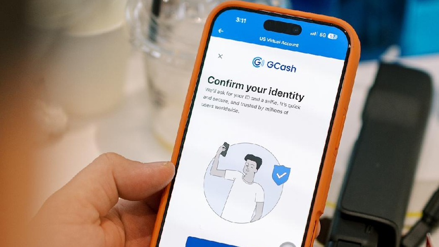
  1. Open the GCash app – Tap US Accounts in the Explore the App section
  2. Tap Continue and verify your information
  3. Complete your account creation

Continue Reading

BizWiz

3 Lessons from women who successfully built careers in freelancing

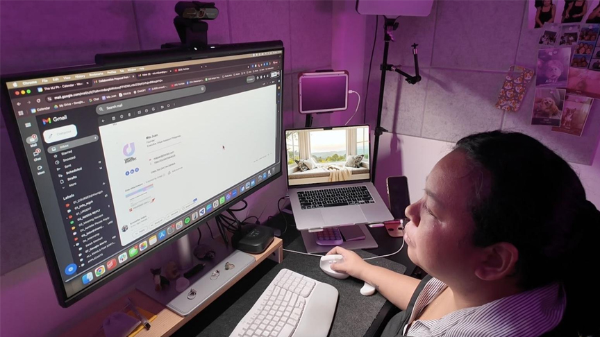
Freelancers face inconsistent income, unpredictable clients, and little guidance on how to navigate it all. For longtime freelancers Mia Juan and Dana Novales, building a career online has meant learning these lessons in real time.
Published

on

 Earning through freelance work has never been more accessible. With a stable internet connection and numerous job platforms, opportunities can come from anywhere – and for many Filipino women, they do. A 2020 study by the Philippine Institute for Development Studies (PIDS) showed that an increasing number of women are engaging in online work because it lets them earn while balancing home responsibilities.

But access doesn’t always mean ease. Freelancers face inconsistent income, unpredictable clients, and little guidance on how to navigate it all. For longtime freelancers Mia Juan and Dana Novales, building a career online has meant learning these lessons in real time. With more women entering the freelancing field, they share three lessons they’ve learned:

1. Build real relationships, not just transactions.

Freelancing can make work feel transactional. You get assigned a task, submit the work, get paid, and then move on. But the most successful freelancers don’t treat work that way. In such an unpredictable field, being remembered matters.

According to Dana, “Real relationships are built on service, not strategy.” Every “Well done!” or “Good work!” can open doors to new opportunities, so don’t waste them. Instead, take an extra step to establish a real relationship with your clients: check in, understand what they need, and find ways to make the process easy for them.

2. Set up systems that work for you.

Handling different clients with different ways of working can get overwhelming fast. For Mia, having systems for your workflow simply makes this easier and helps manage client expectations.

That can be as simple as being clear about what services you offer. “It’s basically saying this is what I can offer and setting a clear boundary of what you do not do. That way, there is no miscommunication of responsibilities, which happens commonly in freelancing work,” she shares. It also helps to have a proper onboarding flow – having contracts, timelines, and payment terms in place before you start, not while you’re already in the middle of the work.

3. Find solutions that work for your peace of mind.

Some challenges only appear once you’re in the midst of them, and for many freelancers, realizing that foreign payments come with fees, delays, and uncertainty is when freelancing starts to feel stressful.

“Earning in USD sounds exciting–until fees, forex, and delays eat into your income,” Dana points out. She shares that this is something she wishes she had known earlier in her freelancing career. “That’s why there is importance in having the right structures in place, especially if you’re a mom who has to think of managing your home, paying your bills, among many other responsibilities.”

That’s why Mia and Dana now use the new GCash Virtual US Account, a feature within the GCash app that lets freelancers receive USD payments from US clients more directly without the usual surcharges. After creating an account, you get your own ACH and Wire Routing Number, which you can give to your clients for direct deposits of your pay.

You can also choose to convert your USD to PHP when you want, depending on live forex rates, which you can see on the platform – giving you control over how much you actually receive. Once it’s in your wallet, you can use it to send money, pay bills, or add to your savings.

Creating a GCash Virtual US Account is easy in just a few steps.

  1. Open the GCash app. Tap US Accounts in the Explore the App section
  2. Tap Continue and verify your information
  3. Complete your account creation

Continue Reading
Advertisement
Advertisement

Like us on Facebook

Trending